Imagine visiting a website on your smartphone and the text is too small to read, buttons are impossible to tap, and you have to zoom in and out just to navigate. What do you do? You leave. Immediately. And you never come back.
This is exactly what happens to thousands of businesses every single day because they don't have a mobile-responsive website. In 2026, having a website that works only on a desktop is like having a shop with a door too small for customers to enter. It simply doesn't make sense.
Whether you are a startup, a local business, or an established brand, a mobile-friendly website is no longer a luxury — it is an absolute necessity. In this blog, we will break down exactly why responsive web design is non-negotiable in 2026 and what happens if you ignore it.
The Mobile Revolution: Where Are We in 2026?
The numbers don't lie. As of 2026, more than 65% of all global web traffic comes from mobile devices. People are browsing, shopping, reading, and making decisions on their smartphones more than ever before. From ordering food to booking a doctor's appointment, everything happens on mobile.
If your website design in 2026 is not optimized for mobile users, you are essentially turning away the majority of your potential customers. The shift to mobile is not coming — it has already happened. Businesses that fail to adapt are already falling behind.
What is a Mobile-Responsive Website?
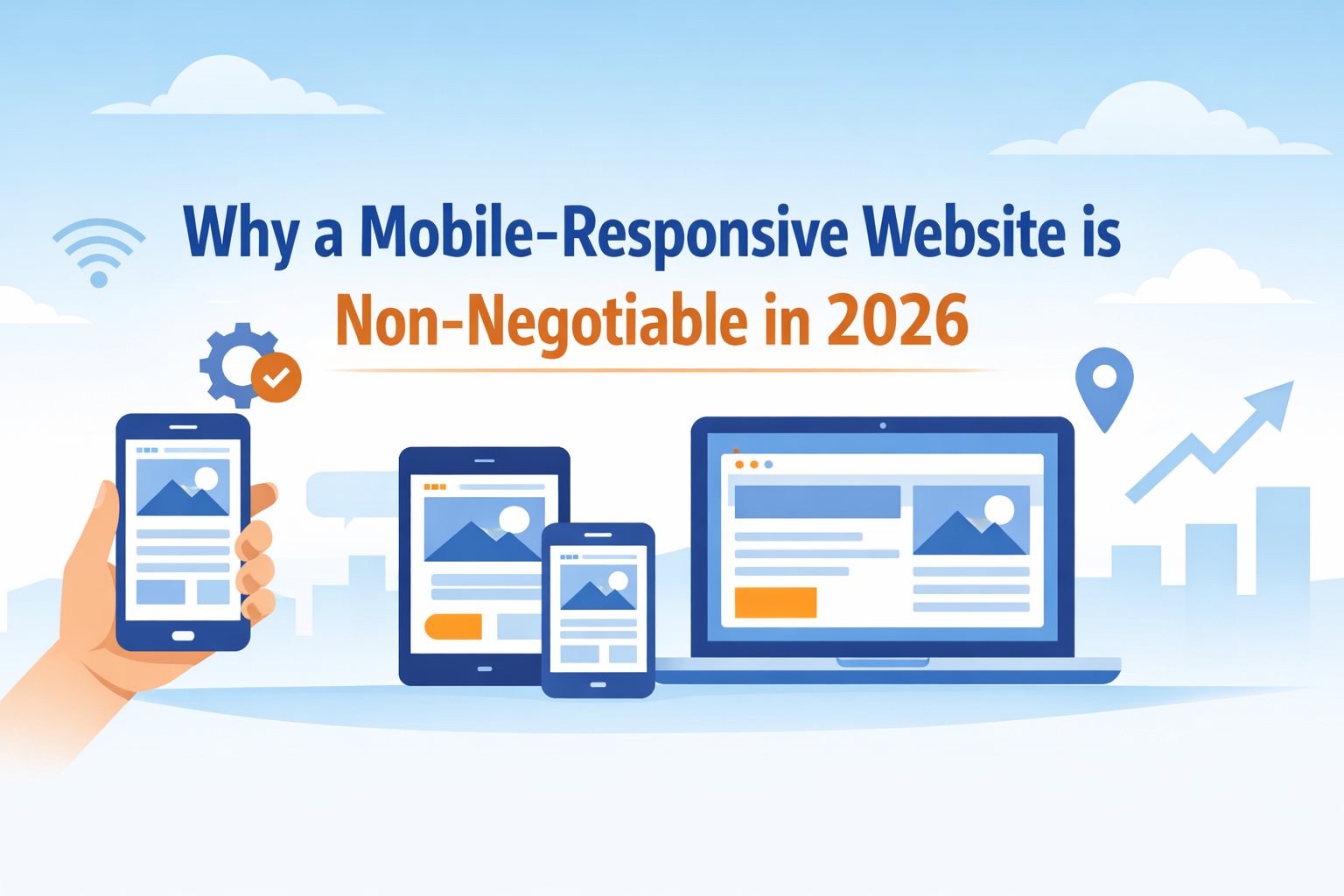
A mobile-responsive website is a website that automatically adjusts its layout, images, and content to fit the screen size of any device — whether it's a smartphone, tablet, or desktop computer. It uses fluid grids, flexible images, and CSS media queries to deliver a seamless experience across all screen sizes.
Responsive web design ensures that your website looks great and functions perfectly on every device without requiring the user to zoom, scroll sideways, or struggle with navigation. Simply put, it adapts to the user — not the other way around.
Why Mobile-Responsive Design is Non-Negotiable in 2026
1. Google Mobile-First Indexing
One of the biggest reasons to invest in a mobile-friendly website is Google mobile-first indexing. Since 2020, Google has been using the mobile version of websites as the primary version for indexing and ranking. This means if your website is not mobile-optimized, Google will rank you lower in search results — no matter how good your desktop version looks.
In 2026, Google mobile-first indexing is fully enforced across the board. If you want to appear on the first page of Google search results, your mobile experience must be flawless. This is the core of Mobile SEO — and ignoring it means losing organic traffic to your competitors.
2. Mobile SEO Drives Organic Traffic
Mobile SEO is not just about making your site look good on a phone. It involves fast loading speeds, proper font sizes, touch-friendly buttons, and structured data. Search engines reward websites that offer excellent mobile user experience (UX) with higher rankings and more visibility.
When you implement proper website mobile optimization tips — like compressing images, enabling browser caching, using AMP (Accelerated Mobile Pages), and minimizing redirects — your website loads faster on mobile. Faster loading means lower bounce rates, higher engagement, and better SEO rankings.
3. Mobile User Experience (UX) Impacts Conversions
A poor mobile user experience (UX) directly kills your conversions. Studies show that 53% of mobile users abandon a website if it takes more than 3 seconds to load. If your website is difficult to navigate on a phone, visitors will leave and purchase from a competitor who offers a smoother experience.
On the other hand, a well-designed mobile-responsive website keeps users engaged, builds trust, and guides them through the buying journey effortlessly. Whether it's filling out a contact form, making a purchase, or signing up for a newsletter — a great mobile UX makes it all easy and intuitive.
4. Increase Website Traffic with Mobile Design
One of the smartest website mobile optimization tips is to treat mobile design as a traffic strategy, not just a design preference. When your website is mobile-responsive, it ranks better on Google, gets shared more on social media (where most sharing happens on mobile), and attracts more visitors organically.
To increase website traffic with mobile design, focus on:
-
Clean and fast mobile layouts
-
Easy-to-read fonts and clear CTAs
-
Mobile-friendly navigation menus
-
Optimized images and videos
-
Smooth checkout or contact processes
All of these elements work together to improve both SEO and user retention, resulting in consistent traffic growth.
5. Mobile Responsive Website vs Desktop Website
Many business owners still ask: "Do I really need a mobile-responsive website if I already have a desktop website?" The answer is a clear yes. Let's understand the mobile responsive website vs desktop website debate once and for all.
A desktop-only website may look visually impressive on a large screen, but it fails completely on mobile. Text becomes tiny, images overflow, and navigation becomes a nightmare. A mobile responsive website vs desktop website comparison shows that mobile-responsive sites have:
-
Lower bounce rates (users stay longer)
-
Higher conversion rates (users take action more easily)
-
Better SEO rankings (Google prefers mobile-first)
-
Broader audience reach (works on all devices)
-
Better brand credibility (professional appearance on all screens)
Choosing a desktop-only website in 2026 is simply not a viable option for any serious business.
Industries That Cannot Afford to Ignore Mobile Responsiveness
Every industry is affected, but some are particularly at risk:
E-commerce: If your online store is not mobile-friendly, customers will abandon their carts and buy from Amazon or another competitor with a better mobile experience.
Healthcare: Patients book appointments, check symptoms, and find doctors on their phones. A non-responsive healthcare website loses patients immediately.
Real Estate: Property seekers browse listings on mobile. A website that doesn't display property images properly on a phone is useless.
Restaurants & Local Businesses: People search for "restaurant near me" on their phones. If your website doesn't load well on mobile, you lose walk-in customers too.
How Website Design in 2026 Has Changed
Website design in 2026 is driven by mobile-first thinking. Designers now start by designing for the smallest screen first and then scale up to larger screens. This approach — called Mobile-First Design — ensures that the core user experience is always optimized for mobile before anything else.
Modern website design in 2026 also incorporates:
-
Dark mode compatibility
-
Voice search optimization
-
AI-powered personalization
-
Progressive Web Apps (PWA)
-
Lightning-fast Core Web Vitals scores
All of these features are built around delivering a superior mobile experience that keeps users engaged and coming back.
Partner with the Right Experts
Building a truly mobile-responsive website requires technical expertise, design skill, and an understanding of Mobile SEO best practices. This is where working with the right digital partner makes all the difference.
If you are a business in Rajasthan looking to build or upgrade your online presence, partnering with a professional app development company in Jaipur can be a game-changer. A skilled app development company in Jaipur understands the local market, the latest responsive web design standards, and how to create mobile-friendly digital solutions that drive real business results — whether it's a mobile-responsive website, a native mobile app, or a Progressive Web App.
From crafting seamless mobile user experience (UX) to implementing advanced website mobile optimization tips, the right development team ensures your business stays competitive in 2026 and beyond.
Final Thoughts
The message is crystal clear: in 2026, a mobile-responsive website is not optional — it is the foundation of your entire digital strategy. From Google mobile-first indexing to Mobile SEO, from mobile user experience (UX) to the ongoing debate of mobile responsive website vs desktop website — every data point, every trend, and every user behavior confirms the same truth.
Your customers are on mobile. Google is on mobile. Your competitors are going mobile. The only question is — are you?
Don't let an outdated, non-responsive website cost you customers, rankings, and revenue. Invest in responsive web design today, implement the best website mobile optimization tips, and increase website traffic with mobile design that truly works for your audience.
The future is mobile. Make sure your business is ready for it.